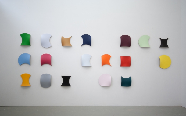
BH: Deceptively simple, singularly shaped and formed, canvases bloom from the wall each in a different color. Hung together they suggest a word, a string of them, arranged to convey the written form, though any attempt to decipher or push this further only adds umbrage. Instead, when the syntactic muscle relaxes, the color forms open to the heart of the matter, to an abstraction of color and form. And like a bloom, what at first appears singular blends into a myriad of differing shades and variations of color beyond any particular hue – here infinite greens, purples, oranges and blues come through.
Language is a marvel. And The Alphabet of Silly Colors is a good place to start.
JMV: Much of my work begins with a circle as the starting point for building the stretcher frame. This is opposite to a rectangular or square format which is typically understood as the archetypical shape of a 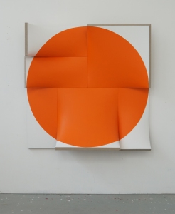 painting. I’ve made quite a few works departing from this simple idea of cutting the circle into four equal parts and tilting them so structurally the circle appears wanting to be squared. The tilting makes the stretcher frame spatial, and thus that’s how the linen gets its curved surface. The three-dimensionality moves away from a flat painting, and while looking to sculpture the ‘getting to a square’ underscores what we understand a painting to be, with its expected flatness.
True, a contributing element to The Alphabet is color, and I’m willing to go so far as to agree that as a series of paintings they are exuberantly colorful, while, at the same time it needs to be appreciated each work is one color, a monochrome, which is a particularly reduced way of using color. As such, the work reflects my ambivalence towards color in terms of relationships and or meanings that are pinned to color choices. It’s not that I don’t like the sensation of color or its evocation of feelings, I just prefer to keep that subjectivity away from having any major importance or grand meaning in my work.
It was only during the making of the first number of works from this series that I realized they have a strong graphic feel. Seeing a few in a row struck me how they could function as an alphabet. There are only 18 shapes, but by turning them upside down or mirroring them, the possibilities become multiplied, where a ‘p’ upside down becomes a ‘d’ while a mirrored ‘d’ reads as a ‘b’. This way I actually succeeded in making a real font out of the series. And, yes, the way I usually prefer to hang the works suggests a visual poem, with the arrangement being dependent on the size of the wall, and the colors interacting with the ‘rest’ forms which I see as counter shapes existing between the colorful shapes.
BH: Your work, including the ‘silly paintings’, is always painted only on one side – the front, which again draws attention to the focus of painting, even though it’s also very sculptural. I know that you have been very clear about what you do is painting, and when the work is identified as sculpture, from your perspective, you have added that then in those terms it does not succeed.
So, what does it say to make good painting with a sculptural bent? And how does the curved surface and structure work with the color?
JMV: Yes, I do think it makes sense to call it just painting. At first, because it is fundamentally about surface, or skin if you like, the three-dimensional stretcher frames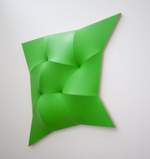 evoke an almost organic feel, even sensual with people wanting to walk up and touch.
By protruding out, the shape changes when you walk around the work. There is a role for the viewer to explore by changing their position, therefore shifting their engagement with the work. The modular pieces are meant to be some kind of Lego system in which people are invited to build their own order. Also, as I think color is a very private thing the silly colors imply that any color can be chosen based on a personal preference. I like it when viewers feel free to like or dislike a work as opposed to being told how to read things.
And, yes, I have said that my work sucks as sculpture. I could have said analogous to this that the floor works by Carl Andre suck as painting. They are as flat as a painting, but if you hung them on the wall they wouldn’t make sense. By minimalizing the volume of the sculpture, he maximizes the volume of the space around it. This is also the space the viewer is in, wherein the viewer becomes part of the work.
I think something similar happens with maximizing the painting into the third dimension where it works as if it is reaching out to the viewer, where there is this sense of being absorbed by the painting. I realized that even as a figurative painter I used to be very aware of the space outside the painting. With the Alphabet and also other work such as the Dynamic Monochromes, the space outside the object can also take on a more autonomous role as a ‘rest form’.
But to get back to your question, to me it is never a ‘sculptural’ bent, it’s more about the bending of painting.
BH: I’m looking at a marked up drawing, which appears to be extremely complex in its calculations and degrees, and I’m wondering how you start off on a project, and, in particular, I’m thinking about the series Dynamic Monochromes, dated 2012, which again are single colored structures, this time with more complicated folds.
JMV: The Dynamic Monochromes have evolved from a series called multi-chromes which I started in 2010. These works were modular pieces based on circles bent into squares. They were kind of anti-color in the sense that I painted them black, white or gray. However, I added just a slight drop of color to each different module. When the usual nine pieces 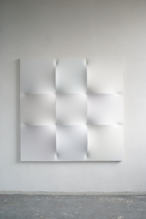 came together the work consisted of all different shades of white, black or gray.
At this stage, it started to bother me that I had restricted myself to symmetry by working with squares and circles. The Alphabet is actually an attempt to escape from this as well. The Dynamic Monochromes, however, are a step further. In this series, each module is a full circle cut in four uneven parts. By consequence, the shapes are no longer symmetrical and the work becomes more dynamic in all directions – flat as well as spatially as the smaller parts stick out less than the larger ones. At the sides, the circle pieces are flattened, which determines the length of each part of the outline.
With the decision to use unevenly cut circle parts the work becomes full of possibilities. Not endless, but I am forced to set the piece into a shape which I couldn’t have imagined forehand. The working sketches are made using a drafting compass. I had to make intuitive and aesthetic decisions on the angles. On the drawings, the angles are filled with numbers, however, these are just simple calculations for the cross-cut saw.
As intuitive and arbitrary as the shapes come out, the color is no less intuitive as well. A statement I made a few years ago for a show of white art at the CCNOA in Brussels addressed this issue of color. During that time, I had limited myself to producing solely white works and stated that while I didn’t mind color, and actually liked it, the work wasn’t about color, but about the possibilities and promise. I went on to say that if someone wanted to buy a white work, I’d painting it any color they liked.
BH: Point taken regarding your ambivalence toward color, though perhaps I’m not entirely convinced. Strong resistance to any preference suggests in all likelihood that something else is going on behind the scenes. And while I’m with you when you say that working primarily in monochrome alleviates the need to play one color off of the next, the arrangement of a series does suggest that underlying factors are being played out, seen in their choices, arrangements and color’s associative reappearances. But 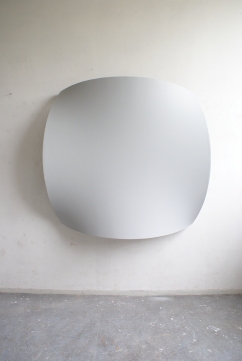 let’s take a break from the gridlock of healthy disagreement, and look at some of the other systems you employ to focus on the choices that lead to the differences between Dynamic Monochromes, and the Improved Dynamic Monochromes?
JMV: I do have a strong preference for color, just as I have a strong preference for my love, Lily, and my children. That doesn’t mean that I have to display this. I do choose and arrange color with preference and personal interest, but I don’t want the colors I use to be looked at this way. I prefer them to be seen as propositions or possibilities in which people rather make their own choices. That way I see art as a field of going forward, exploration and freedom rather than a display of ego.
That is actually what ‘Improved’ means as in Improved Dynamic Monochromes. Simply making steps forward. This is the challenge. I never regard a work as sublime. It’s always a passage to the next work or the next body of works. I used the word ‘Improved’ in a title firstly for the series Improved Flat-out Pointless works as a next step to the Flat-out Pointless works, which in their turn are a next step in the series Pointless works. There is some irony in this too, of course – a lot actually. At the same time, it’s deadly serious. As I believe life (and art) is pointless, but it makes sense to improve it.
The choices in the ‘Improved’ Dynamic Monochromes are motivated by the opportunity to make the Dynamic Monochromes even more dynamic by cutting them up as long as they don’t fall apart. As I felt I was reaching an endpoint in these works, I started to concern myself with the surface, which I had previously kept dry, matt and as un-painterly as possible for many years.
In this new body of work, I’m not sure why it happened but I started working with very glossy automotive spray paints, and I guess what I was intrigued with was the combination of seeing the wall through the ruptured gaps in the painting. In fact, you could see the entire surrounding space in the reflection. I have used chrome spray in the past, but it was always a means of avoiding the use of color. That said, those chrome works were never as glossy and reflective as the current ones.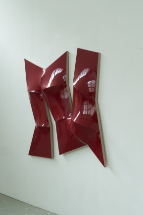
BH: The improved shine, along with the structure and reflection’s fracture, does move the reading along. Though going back to the earlier Dynamic Monochrome, there’s a slowness that creeps up on you, and I like that. This is where choice becomes a difficult task. When, and I need to add ‘if’, as I don’t know whether you work this way, a Dynamic Monochrome sits within the same site with an ‘Improved’, and without the titles being obvious or at hand to read, the idea of improving can fade as preference starts to play a major part: and this, as I understand it, is what you are saying regarding the open-ended, or either way option which is very much integral to your practice within the language of visual puns and the double edge.
The Pointing Out series is intriguing. They grow on you in their robust and almost complete circular format, with the square pointing out as an edge from an almost pure surface. Some read as pond, from where a stretcher bar’s edge emerges front.
JMV: Perhaps the first Dynamic Monochromes are more obviously related to the outline of a usual stretcher frame. They read as deformed squares and therefore, sure enough, they are more easierly seen as somewhat deformed paintings. While the Improved Dynamic Monochromes might read as more free-form, calling them ‘improved’ does not mean they are better, as, in the end, I use the term ironically, and it’s not up to me at all to decide which work is best, or the most improved.
Sometimes works come out as just as good as they can and don’t need any improvements at all. That’s all fine but I don’t want to sit around and stare at them all day. I want to move on to some other challenge. So the ‘improved’ notion is just about moving forward with my ideas. But it’s interesting to think that whatever ‘new improved’ work I’m 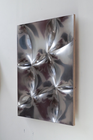 working on at the time is ‘improved’, even if it is not. I’m still happy to be very aware of pretending I’m improving. And while sometimes I think I succeed, mostly I don’t.
That’s very different from the feedback I get from collectors, gallerists and curators who react to my work mostly favorably in an ‘improving’ and ‘approving’ sort of a way.
I do like your reference to a pond in the Pointing Out series, especially the idea that something comes out that is usually hidden. Front on, you see what usually is an edge. Maybe it’s working similarly in a direct non-objective or concrete way to what Cubists did figuratively. You can see the front and side at the same time which might be interpreted as the stetchers drowning in a lake or pond.
To me they are plane geometry as well, in which a circle, square and triangle come together in one painting. And they are flexible modules. You can separate the two parts and place them in opposite corners of the room as corner pieces, if you like.
BH: I like the idea of not knowing, or even really caring if there is improvement or not, while entertaining the idea that there is a progression, at least within one’s own terms introspectively.
I can’t pigeon–hole you into a formalist aesthetic, as your concerns are playful while being informed by art history and the intensity of your own practice. You seem to be reiterating the position of the viewer, empowering them to envisage the whole story, though embedded in this viewer empowerment is an artist’s healthy dose of doubt. I see this as an act of playfulness, which I really respect. And I guess you are asking the viewer to be open and playful as well.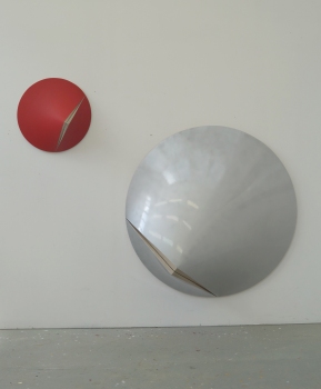
JMV: This would mean a formalist aesthetic is not playful. I think, perhaps, I’m an unsatisfied formalist aesthetician escaping his own rigidity.
Nevertheless, I do find myself agreeing with you somewhat. There is a lot of ambivalence and doubt, that’s true. And one of my solutions is definitely ‘playfulness’. At the same time, there is also a struggling and labor intensity quite opposite to the lightness you suggest. With the automotive spray paints that I’ve been recently using, the amount of effort needed to obtain what I’m looking for seems to becoming an even more difficult and time consuming enterprise. There are a lot of layers applied, sanded between each, to get to that place where the surface is smooth enough to achieve the reflective shine that I want.
As for the viewer’s engagement, I do appreciate if people are using the work in a playful way. On the back of the work I usually place arrows in all directions suggesting that you can hang the work in any direction you like. The whole idea that a work of art can only be seen in the way the artist intended just seems wrong to me.
BH: What are some of the challenges of spraying automotive paint on linen, and what benefits do you see in the result?
JMV: Most challenging is to get rid of the structure of the linen. This requires a lot of layers of primer and sanding. As industrial as it looks, it actually intensifies the craft. Everything I aimed for in my work so far comes together in the spraying; from the initial wish to avoid the handwriting and individualism of postmodernism to the merging of design, painting and space.
In the first sprayed Dynamic Monochromes it was just about the multitude of reflections 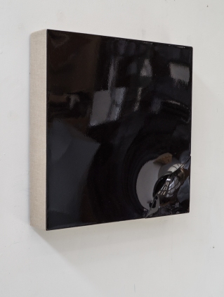 that attracted me. While, with the newer Pointing In works, such as Drain, the possibilities are extended to where the work really does absorb the entire surroundings just from the construction of one well-positioned hole.
I see further possibilities in the manipulation of space where color makes its appearance not by covering the front surface but by allowing it to appear as reflections on the mirrored white surfaces. This can also work a similar way in black!
BH: Are you planning any projects that are less strenuous? Or is it regardless of what the project is there are challenges, and that’s all part of the fun?
JMV: If there are no challenges there is no fun. The whole idea of being able to continue an artistic production is being able to find challenges. If there is no problem, you have to create one. The magnitude of it doesn’t matter, it’s just about locating and resolving it.
