
Brent: Behind every good story lurks a liar: a borrower, a truth teller, and a lark.
First and foremost you are a painter. And the work you make is painted flat. The surfaces hold the legacy of hard-edge painting and color abstraction, and this is true whether you are creating large wall paintings in situ, or in the studio making images on small separate panels. There is humor! And this, perhaps, comes with the dialog with Dutch non-objective painting and pop minimalism. The forms you use are simple. But what you do with them spatially as well as color-wise keep integrity and humor equally up to speed. A title gets worked out much like a theme does – in that – say, with something like zigzag, it will reappear and morph into a seemingly inexhaustible supply of sly motifs and gags that play with the mind and pull at our perceptual purse strings…
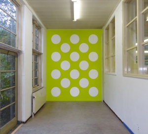
Guido: I move between different ongoing series. These are held together by the title, which usually consists of one word and has its origin in small ideas. 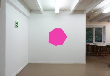 Tickertape, for instance, is based on the tickertape scattered from buildings during a parade. The idea of the sky and the streets filled with little white spots of paper is a humorous interpretation for the series that deals with repetition and arranging.
While working on different series at the same time the shapes and colors I use get influenced by each other and change gradually. They move around in the series and pop up if needed. They can change from a singular form to a motif. I like this freedom to move, it’s the fun part of the research that I do in my work, the playtime. I guess it has its origin in me as a person. I don’t want to make work that’s too dogmatic.
Brent: Rubble (the wall painting with the singular pink form) talks to a very classical elegance. I’m actually wondering how that gained place in the Rubble series? And I could ask where the title finds itself in the actual wall painting. But that aside, it’s the simplicity of the singular that strikes me most; how it enlivens the space around; how it forces you to read back to the perfectly poised pink in rotation. And then the title returns, and it lingers.
Guido: The pink wall painting is a good example of the transformation of shapes in a series. Within the rubble series this transformation shifts between oval forms, lines, rectangles and in this case a heptagon. It shows how a singular form works, opposed to a surface filled with multiple forms like most rubble paintings.
I found out that the irregular shape works best in this position. I like the inevitability of that. It’s the same with the proportions of the form and the rest of the wall; they only work best in a certain size. That’s when the whole wall becomes a work, when in fact you only paint one form on it.

Brent: And another very large wall work, again titled Rubble, is made up of ovals. I’ll come back to that. You also mention that Rubble can contain lines, rectangles, and, I notice, half circles. These are on separate small panels each no larger than 12 inches. They work as a set, though still I’m not sure how the title swings them all together. They are humorous, fun, even animated! But formally they root out some very interesting places and spaces for painting.
Guido: I’ve presented the Rubble series together once and it really did read like a story, and yes, it did kind of come across as a comic. And I enjoyed that! However the narrative wasn’t based on a storyline, instead the connections between the different canvases had more to do with the formal qualities; a visual disruptiveness through the boldness of shape, line, and color.
Actually, the whole series and individual pieces play with disorder, working intuitively within set boundaries. The pink Rubble wall painting is a tricky one here, as it’s obviously well balanced on the wall. But the shape itself is totally arbitrary, which makes it suitable as Rubble. The disorder here is the choice of the shape (derived from other forms in the series)… chaos with a wink.
Brent: Returning to the large rubble wall work, was there a drawing or a plan, or did the location dictate how the installation would look? The same goes for the small works on canvas, are they planned to a detail, with preliminary drawings or doodles? Or, where does it start?
Guido: I collect ideas for works in a sketchbook. It’s a combination of doodles, little sketches, bits of texts and words (that can be used as titles). This is where it all starts. By the way, there’s no color in the sketchbook.
 I design the actual works by computer, making lots of sketches to fine-tune them. Designing a wall painting works slightly different. The architectural circumstances, like measurements of a wall, corners, doors etc, play an important part in the design. Each work is designed for a specific space and functions best there. They integrate in the surroundings, but keep a self-contained quality. A combination of the given facts of a space and the ideas that originate from the sketchbook determines what kind of work it will be.
Brent: It makes sense that the design and color get worked out on the computer. I can see that clearly as the colors you use have a screen feel, in that they are very poppy and fluorescent. In Tickertape the design is simple and has the look of a reverse sheet of dot stickers, which charges the piece despite it really being only one color.
In another installation, also entitled Tickertape (this one with a blue background with the white circles) the support is braced off from the floor at an angle. The architecture informs both pieces, but each end up working very differently. How did that work for you?

Guido: I always tend to put some fluorescent color in when I’m mixing paint. Maybe that comes from the designing part on the computer. On a screen light comes from behind, so the colors are much more vibrant. I like vibrant outspoken colors. By mixing them myself, I can make off-colors.I don’t like harmony so much; there is always a tension. These colors help to achieve this. I’m always refining a sketch to get that tension, shifting forms a little or just stirring up colors. But always keeping in mind that less is best. One of my favorite quotes is by Roy Lichtenstein: it’s not that simple to be simple.
The wall (for the blue and white tickertape work) was assigned to me in the exhibition, and, as you say, was tilted and hovering above the floor. That’s quite some information to work with, was my thinking at the time. So I had to keep it simple: it was based on a sketch that had white dots along horizontal lines. I reworked this sketch to fit in to the tilted wall, but that meant that some dots didn’t fit, because of the angle of the wall. Those dots I left out.
One of the rules I set for this piece was that everything should stay within the floating wall area, and not to extend outside the wall. That way the image remained contained. The result was a work that’s simple and obvious, but still looked just off or illogical. I like that tension.

Brent: You say you don’t like harmony, but what I see, especially with the installation work, is that the design has everything to do with harmony, albeit a dissonant harmony. Adding your particular brand of humor creates a sum that is entertaining just as it is formally succinct.
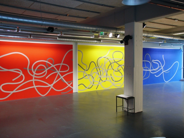
And, if we look at some examples, the columns in the large Rubble installation could have been painted with the organic rock motif but are not ––you chose to keep  things flat to the wall, the columns thus functioning as gaps or pauses, massively large physical ones at that. Another: the parallel white pipes in Knot. The pipes are real but in paint on the wall they become a twisted replica with humorous scale differentiation. With Zigzag the boxes and whatnots attract you like odd socks. Zigzag also has the stroke of a roller, you know, when you use a roller to paint or prime a wall. Again, there is this animation thing going on, and it’s a real plus. Add the bits and pieces that reconfigure the flow, you end up with this not-bare-minimal color arrangement, but instead a playful discordant song, punctuated by encroaching dramas sometimes big sometimes small.
Guido: Dissonant harmony, that’s a good one. The works should let your mind short-circuit a bit, so it gets your attention. The disruptions on the walls add up to that. They let the work be part of the real world and the actual space.
When I just started making wall paintings I always asked for difficult walls, with corners and doors or in stairways. Now I go for the more subtle disturbances, which give that dissonant harmony. I especially like sockets. I don’t mind it at all, if there’s a box or some pipes on a wall. It’s just a given fact you have to deal with. The fun is in creating a work that ignores them as well as embraces them. The playfulness in the zigzag work is a sum of all the components. The wall, the disruptions, the use of color, the cartoonish strokes, the scale, the desk in front. Even though the idea is quite minimal (black versus white, horizontal versus vertical) the outcome isn’t.
 Now you come to say it, the work does look like a pair of odd socks, but they still keep your feet warm.
Brent: Canvas as conundrum: the small discrete canvases or panels are something else. They are objects with a graphic image painted on the front with a color field wrapped around the edge. They are images weighed in, alive, and, as such, successful… I want one!
What’s the logic of their success?
Guido: Initially I started working on canvas, but I never painted the sides. Flatness was (and still is) the focus. I then changed to working on panels because I wanted to emphasize the difference between the small paintings and the installations. Large works have an impact on the surroundings, just as, and we have talked about this, the location and its details influence the final work. And it’s definitely different when you have these small intimate objects. So, sure, there has to be a good reason why you make a wall painting, and then work at a smaller scale.
With the wall paintings my curiousness is triggered with flatness: I only paint the walls and the image is super flat, but the surroundings do something with that to make it all real space. And, as such, the viewer navigates the space not only with flatness in mind but also becomes very conscious of the volume of space that the wall paintings inhabit.
The panels work differently. They draw the viewer in to their little universe.
Both the wall work and panel work have the same graphic imagery, but because of scale and a different sense of ‘objectness’ the graphic quality shifts considerably. The panels have all the tools to suck up a viewer. The paint is very matt, not shiny and reflecting, but absorbing. They also, as you said, are wrapped in color. And in that sense edge towards being an object, but are, and still stay in the realm of paintings, not sculpture.
I like handling these small works, they’re fun to make and kind of luscious and gem-like despite the matt surface. Making them in my studio feels a little like cooking up something in a lab, having a good idea what will happen, but also there’s the element of mystery.
Brent: Odd things, enchanting in their simplicity, for sure!

Great article and work!
I love the work and great to read the interview!
Sweet interview and beautiful work. Congratulations, Guido, on your upcoming show in Seattle opening soon!